Impactful user experiences do not just delight, but also improve our users lives by directly addressing the issues they face. The UX design process is a series of iterative steps that help guide teams toward the desired objectives of a human-centered experience. These steps, however, are not cast in stone; We can be flexible in how we sequence and overlap them to arrive at our solutions. Understanding this iterative UX process is the first step in the development of products that truly address user needs.
UX Design Process
UX design is a crucial part of business success because it addresses essential elements of delivering customer satisfaction. UX begins with empathy and understanding our customer’s current state, needs, and wants. The UX design process has 4 major stages:
- Discover
- Define
- Develop
- Deliver
Discover:
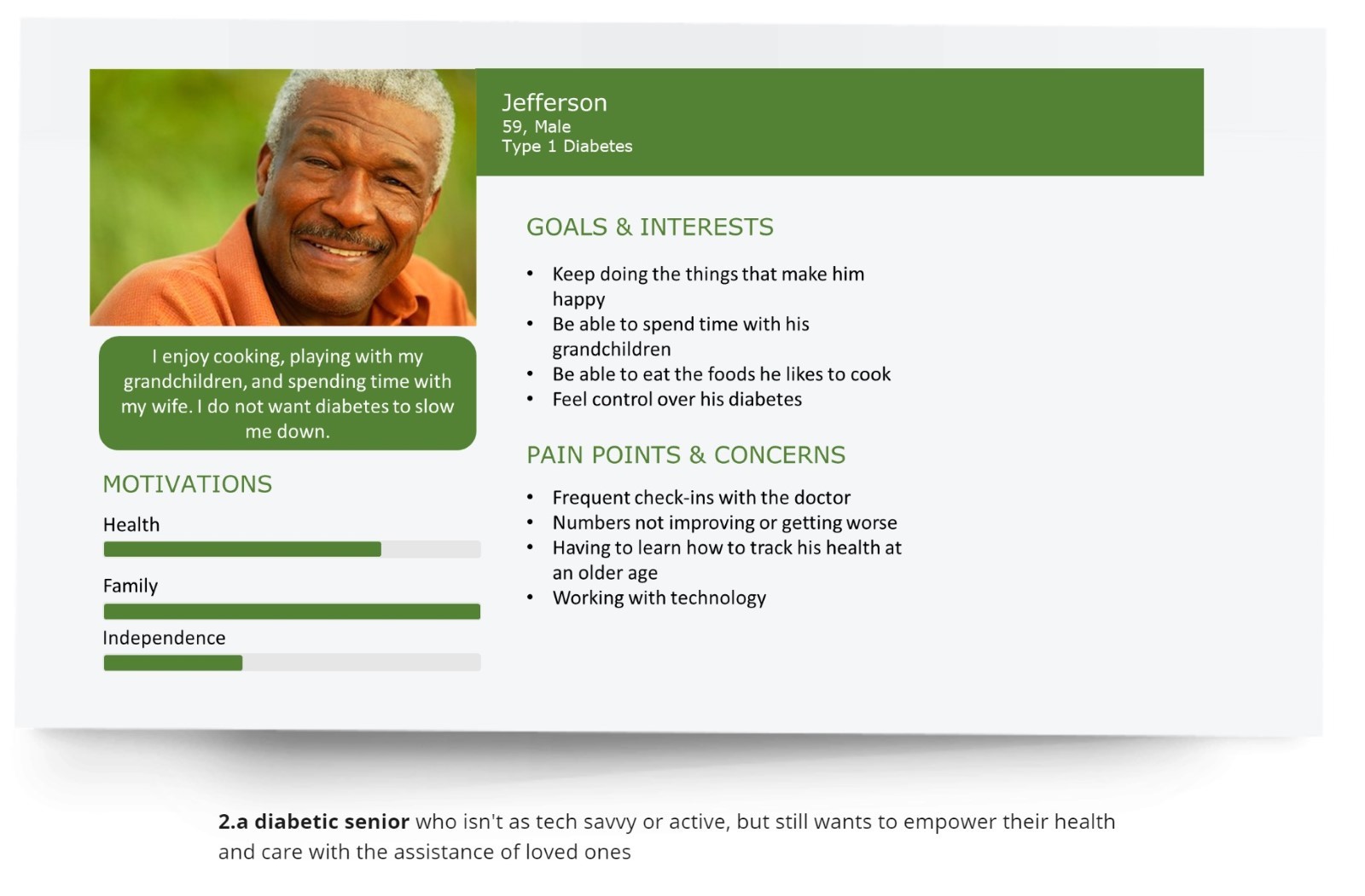
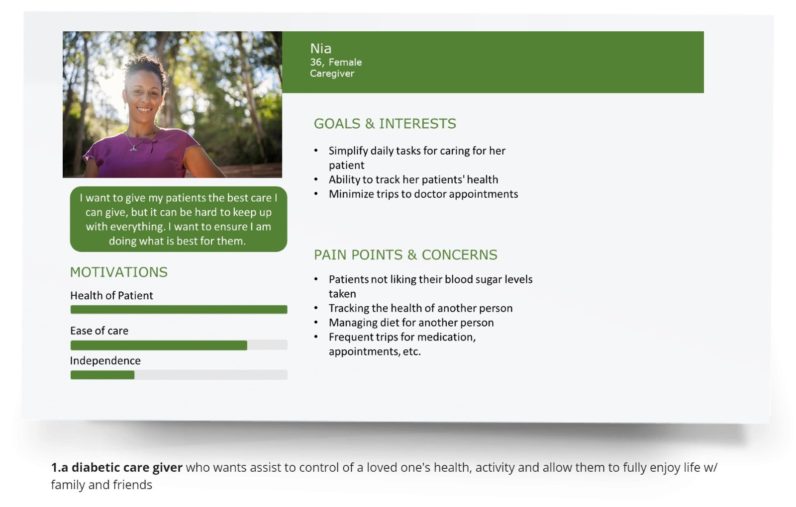
The discovery serves 2 primary purposes – to understand users and their requirements. We create user personas based on users whose goals and characteristics represent the needs of a larger group of users. These include age, gender, education, experience, needs, motivations, preferences, and behavior. UX personas are designed to identify the needs, goals, desires, and challenges of our typical users. Personas humanize the design process and help us develop empathy for our user.

Define:
In the define stage, the use of a user journey map gives us a holistic view to identify touchpoints that exist between our users and their engagement with our application, feature, or service. These touchpoints can be identified as pain points where the user needs are unmet or there is some level of frustration. We’ll also find positive touchpoints called highpoints. Lastly, a critical touchpoint in our journey map is what we call moments of truth (MoT). These various touchpoints in our journey map guide us toward possible design solutions and outcomes.
Journey mapping is a way to ensure that our customers’ engagements are identified. A journey map gives us and other stakeholders in our product team a better understanding of how users interact with our products or service. As a follow-up exercise, we can create a future state map reflecting the ideal state after improvement and possible solutions are identified.
A typical journey map follows 4 steps:
- Scenario mapping: A list of high-level steps our users take
- Adding Action: Once our process flow is completed, action steps are added to understand how a user interacts with the system
- Adding Statistics: The analytical data is further added to the map to understand the numbers required in terms of usage
- Final review: A series of reviews from subject matter experts will ensure that there are no gaps. If any are found, we’ll need to modify or recreate the map to truly capture the user’s journey with our product or service
Develop:
In this stage, user’s tasks are converted into specific features or service requirements in a product. To illustrate this, consider the table below which shows the needs of a mobile banking user and possible features we might design.
| User Task |
User need |
Features or services |
| Snapshot view of accounts, and services available |
Immediate access to essentials in records and service in one single place; quick view of balance(s) |
Balance, transactions, monthly income and expenses, transaction history |
| Account Management |
Capability to manage multiple accounts efficiently |
Multi-account and multi-cloud support, payment menu for each account, budget management, expense statistics |
| Bills and Payments |
Easy billing |
Popular payments, default bills, payment reminders, private advisory |
| Money transfers |
Fast transfers |
Card to card, domestic, international, to contacts, transfer fee |
| Find services |
Engagement |
Autocomplete search, categorized offers, images for offers, customized services, social sharing options, and community support. |
This next step in the development phase is to design a prototype of our feature. A prototype can be made of visual elements like wireframes, storyboards, HTML pages, and mock-ups. Prototypes allow us to validate our ideas and gather feedback on the design and functions early on to avoid mistakes during later stages of development.
Fidelity refers to how close a prototype is to the final product. A rough sketch on paper or a digital representation of structure and information using boxes and other shapes are all considered low-fidelity prototypes. The closer our designs appear complete and real to users, such as while a coded interactive prototype, can be considered high-fidelity prototypes. High-fidelity prototypes are more aesthetically pleasing than low-fidelity, and their function is closer to that of the final product.
Regardless of prototype fidelity we want to create designs that convey enough structure and information to test our design with users. Digital Design tools used to develop prototypes, such as Figma and Sketch, support rapid development, allow for quick modifications, and feedback from colleagues, stakeholders, and end-users.
Delivery:
When we reach this stage in the design process, a solution has been validated. This means we’re ready to hand off designs to our development partners for implementation. It is essential to see how it performs. Thus, delivery and measurement of impacts go together at this stage. While assessing the software, if any performance gaps or problems are discovered, the team moves back to the discovery stage, and another development iteration follows.
UX Principles that increase conversions:
Whether we are designing a website, mobile app, or product, our goal is to onboard and retain engagement from our users. Significant work goes into converting a potential user into a fully engaged and active customer. Following a UX design process removes the guesswork from the equation by providing a roadmap based on user data and insights so that we deliver products and services that users want to use.
The following powerful UX principles can be used to ensure customer delight:
Consistency: Imagine you visit a website. After landing on the homepage, you visit other interior pages. You should not have to relearn navigation, search features, and any other persistent elements from one page to the next. Consistency reduces the learning curve required for users by allowing them to understand the structure and elements from one section to the next of a website or an application. Lack of consistency can confuse and even frustrate users.
Observe the consistency maintained in the colors, typography, placement, and alignment in the example of the onboarding screens of an HR mobile application
One task per screen
A single focus per screen is another best practice. It allows the completion of tasks and interaction with our product/features to be simple for a user. Consider booking an Uber ride. In one screen, a user can select their pick-up location. In the next screen they can see and select the drop-off location.
Uber ride pick-up demonstrating single focus per screen
Simple navigation: Navigation on an application must be designed to make any desired item easy to find and understand. Consider the Amazon shopping app. It displays shopping categories and offers to explore on a single screen with scrolling. Clicking an offer will take you directly to the associated product page. It is intuitive and comprehensive. Is there any wonder why other popular eCommerce apps follow this same navigation process?
Single-hand operation: Mobile is the most frequently used device today. Studies have shown that 85% of mobile users navigate content using only one hand. Considering this user behavior, a best practice is to keep navigation items within reach of our user’s thumbs. For example, the popular app WhatsApp placed all their controls either at the top, at the bottom or near the right and left edges of the screen. In doing so, irrespective of the screen size, a user can easily reach any action.
Minimalism
Providing too much information or action items in a single view or screen can be confusing and distracting to users. UX professionals commonly refer to this as cognitive overload. Cognitive overload is what psychologists define as “the situation in which the demands placed on a person by mental work (the cognitive load) are greater than the person’s mental abilities can cope with.”
Limiting content allows users to focus and make decisions quicker. The use of white spaces between content sections also gives information breathing room to allow user to better take in and understand content.
Consider the Brandlucent’s website. It uses a minimalistic design, beginning with a simple screen with few distractions and a single menu button.
Brandlucent home screen demonstrating minimalism
The BrandLucent design offers a simple and focused flow. Additional content becomes visible only after scrolling. This minimalist approach allows their users to focus and act on the intended content on the home page. This single focus thread continues subsequent pages as well.
The next screen displays a list of links centered on the page along with a single call to action button (CTA) labeled “start a project”. Upon clicking the CTA button, users are guided through a series of questions presented one question per page at a time, allowing a singular focus and attention.
Putting the UX Design Cycle to Use
An uninformed user experience can cause frustration and unintended issues like decreased efficiency, loss of revenue and increased costs, overly complicated processes, redundancies, and more. On the other hand, a good user experience can increase productivity, boost revenues and decrease costs, simplify processes, streamline inefficiencies, and increase customer loyalty. For example, consider a mobile-friendly site that attracts new customers. Studies have shown that 67% of mobile users prefer to buy from a mobile-friendly website with good user experience and 74% of users are more likely to revisit.
At Apexon, our UX research and design team follows the design process, starting with understanding business goals and user research. The insights obtained are translated into user personas, journey maps, wireframes, and clickable prototypes. Prototypes are tested, delivered, and modified in iterations that lead to proven solutions for development.
Are you ready to put the UX design process to use? Apexon can help you create a competitive advantage with user-centric research and designs that make a seamless experience for your users. To learn more, check out Apexon’s UX Strategy and Design Services or get in touch directly using the form below.