Color. It is arguably one of the most important and noticeable elements of design. Color affects our everyday life through psychological, emotional and physical responses. It is a crucial factor every designer must consider when assigned to a project.
Have you ever designed an application for an iOS device and found yourself wondering why some colors appear differently than intended? If you answered yes, the reasoning is simple – inconsistent color profiles. A color profile is a set of data that categorizes a color input or output device according to standards set by the International Color Consortium (ICC).
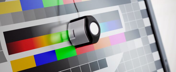
Some iOS devices have different color profiles, therefore, rendering a color differently. Take a look at the example below to see the difference.
As you can see, most of the colors have been drastically altered; hence, the importance of device testing for color management.
Now you’re probably wondering how to test for color accuracy. Well, here’s a great trick on how to easily preview colors for iOS devices inside of Adobe Illustrator.
First, download the iPad.icc color profile.
To install the color profile, open a new finder window and navigate to Macintosh HD > Library > Color Sync > Profiles and then drop the iPad.icc file into that folder.
Now that you have installed the proper color profile, go back into Adobe Illustrator, open your desired file, and choose Edit > Color Settings. Underneath the Settings drop down, ensure that the North America General Purpose 2 option is selected. Finally, choose View > Proof Setup > Customize and then select iPad.icc under the Device to Simulate drop down and enable the Preserve RGB Numbers option by selecting the checkbox.
To view the color shift, go to View > Proof Colors and you will see how the colors will appear on the iPad. If you go back to View > Proof Colors and uncheck the selection, you will notice the difference between the color profile installed on your computer versus the color profile installed for an iPad.
As mentioned earlier, some iOS devices have different color profiles. The 3rdGeneration iPad has an increased gamut resulting in 44% greater color saturation than previously released iOS devices. When Apple created the 3rd Generation iPad, they designed the screen with a gamut extremely close to sRGB, which is the same color profile used in Adobe Illustrator for creating screen display graphics. Therefore, when a designer views a color on their computer’s display, that color will be almost exactly identical to the color on the 3rd Generation iPad.
The two color profiles within iOS devices poses a major challenge for designers. Now, designers will have to test color palettes through a trial-and-error process to ensure the colors match between an iPad2 and a 3rd Generation iPad. Additionally, this means designers will have to create two sets of images for their developers: regular display size images tested with the iPad.icc profile for the iPad2, and retina display size images with the standard sRGB color profile for the 3rdGeneration iPad.
Needless to say, it is extremely crucial to remember the importance of device testing for color management. Otherwise, you will end up with inconsistent color palettes that could have a negative effect on the outcome of your application.
Want to learn more about Apexon? Consult with an expert here.