Darth Vader would have us believe that the “dark side” is the superior side. However, for those of us non-Sith members, the question as to whether dark mode really provides a better user experience over its light mode counterpart is up for debate.
For our users, it’s a matter of personal choice. In fact, switching between the dark and light modes is as simple as changing a setting. As designers, however, the decision isn’t as easy as toggling between two modes. UI/UX designers cannot just turn-on light mode components. UI elements, images, and fonts need to be considered individually to design for dark mode. Uniformed design or functionality will result in poor overall user experience if there is bad design implementation. Understanding the difference, as well as the pros and cons of dark and light modes will give greater insights and better design with our users in mind.
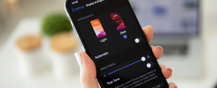
Dark Mode vs Light Mode
The term “contrast polarity” describes the contrast between the text and background on a screen. Dark mode, or negative contrast polarity, is the combination of using brighter or light text on top of a darker background. The opposite of this, positive contrast polarity, or light mode, uses a light background with dark text. Although the choice of using dark mode vs. light mode can be a personal preference, for most people with normal vision the use of light mode can offer better visual performance. On the other hand, dark mode is typically preferred by individuals with eye disorders or users who are on their digital devices at night.
Pros of Dark Mode
Product Flexibility
Even though dark mode can be deemed popular or cool, the decision to include dark mode in your product or app should hinge on value it brings to our user’s experience and the product. Having both dark and light modes may give products an edge over others without this capability.
Consider a product’s battery life, for example. In some instances, it can extend the battery life on your device. The amount of energy saved depends on the settings of brightness in light mode before switching to dark mode.
Increased Design Options
Dark mode gives designers greater opportunities when it comes to design options. A couple of reasons:
- Colors stand out on a black background
- The contrast between backgrounds, images and text is higher
Accessibility with Dark Mode
Dark mode can improve readability for some. In low-light situations, dark mode can be beneficial for our users and those around them because it reduces the amount of bright light emitting from the screen.
- People that can benefit from dark mode include:
- Light-sensitive individuals
- Migraine sufferers
- People with low-vision problems
- Those who have cataracts or related eye disorders
Improve Focus and Health
- Dark themes can help to increase user focus (consider how dark dashboards illuminate at night)
- A study from 2019 revealed that dark mode can lower visual fatigue
- Photophobia, or sensitivity and eye discomfort in bright light, is less likely to result from dark mode
- Academic literature suggests some people who have cataracts or experience related disorders may find that dark mode offers a greater user experience
Cons of Dark Mode
Visibility Issues
Site navigation can prove difficult in dark mode. For individuals who use accessibility tools, navigation using keyboard commands can be challenging as a dark background may block indicator visibility. Additionally, page-to-page navigation can be disconcerting as dark mode can simplify a site’s color scheme.
Individuals with Disorders Can Experience Accessibility Issues
People who suffer from certain disorders including dyslexia and astigmatism can experience difficulties reading light text on dark backgrounds. The University of Michigan’s Dyslexia Help Center, reports dyslexia affects 5-10% of the U.S. population, can be as high as 17%. Astigmatism, disordered vision at any distance, is experienced by 1 out of every 3 people in the United States. Though not the majority, it is important to take all populations into consideration when designing UI/UX.
People who have astigmatism can experience accessibility issues with dark mode because it causes halation, an effect where light spreads beyond its proper boundaries on a photograph or screen. Dark mode can cause these users to experience blurred vision, headaches, and eye strain. In addition to those diagnosed with astigmatism, some people often go undiagnosed and can suffer mild symptoms. That can significantly raise the percentage of users who can potentially experience difficulties using dark mode.
Also, dark themes can prohibit users from seeing information naturally because dark modes may not offer enough contrast. Darker displays cause the iris to open, receiving greater light, causing difficulties that allow users to focus on the content.
How Design Impacts User Experience
Ultimately, you need to design with your users in mind. However, including both light and dark mode in your design gives your users the power to decide what is best for their individual experience. Throughout this article, we’ve explored how dark mode can enhance the user experience. Designing products with light and dark modes increases usability and inclusivity. Dark mode can be a user’s preferred choice for several reasons. It may just be that a user prefers dark mode to light mode.
Alternately, in more extreme situations, when someone is experiencing a visual impairment, dark mode allows them to recognize and read information more easily. These reasons, coupled with the fact that light-mode can elevate risks for eye disease, give designers enough cause to design for both modes and allow users to toggle between the two when necessary. If a device or product can help to alleviate side effects like blurred vision, headaches and eye strain, the user would be more likely to report having a positive user experience.
Apexon helps to create an outstanding user experience. Our understanding of user’s and user engagement allows us to deliver a consistent digital experience. In addition, we recognize the importance of accessible UX (user-experience) design. Check out Apexon’s UX Strategy and Design services or get in touch with us directly using the form below.