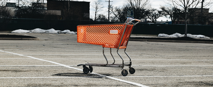
6 UX Mistakes Causing Cart Abandonment (And How to Fix Them)
Manish Shirvalkar

Aug 11,
2022 |
Posted in
UI/UX
If you’re in e-commerce, it’s likely you’re facing a cart crisis. In 2021, reports revealed the cart abandonment rate was nearly 70%. E-commerce brands lose on average $18 billion in sales revenue each year because of deserted virtual shopping trips. In this article, we’ll cover six UX opportunities to positively impact cart abandonment.
6 Reasons Customers Abandon Their Carts
Cart abandonment is when an online shopper adds a product(s) to their cart but leaves the website or app before completing the purchase. To be fair, cart abandonment is a typical and unavoidable part of the e-commerce industry. There will always be consumers who are simply comparing prices, saving items for later, or window shopping. So, it’s important to account for some level of abandonment in your e-commerce pipeline. However, there are still actions enterprises can take to minimize the number of customers ditching their saved items. Let’s take a deeper dive into why shoppers abandon their carts and what can be done to help eradicate the issues.
- Customer Reviews
According to BrightLocal’s Local Consumer Review Survey 2022, 79% of shoppers consider online reviews as trustworthy as personal recommendations. Reviews build trust and help potential customers to feel secure with their purchase. From reviews, users can also more accurately form a mental image of the product.
It’s worthy to note that displaying customer reviews can help increase conversions by 270%.
What can be done?
To help curb abandonment and instill trust amongst users, it’s recommended to display reviews for every product. These reviews would include ratings and comments from customers who have already bought the product. Having reviews at their fingertips, users can evaluate the product and make informed buying decisions.
- Call to Action
It’s key to show users clear calls to action (CTA). It’s pivotal to the success of your business to have a clear CTA that’s easy to find and follow. Once shoppers have an item in their cart, a good CTA will give clear action steps. Almost 53% of CTAs take users more than three seconds to find—that’s too long. The proof? According to Google, 53% of visits are abandoned if a mobile site takes longer than 3 seconds to load.

Following UX best practices, what can be done to more effectively communicate and display a CTA?
- Ensure the load time for CTAs is minimized
- Make CTAs prominent on the page
- Implement A/B tests to validate a better working design
- Display a simple and easy-to-understand checkout button on each page that will take customers directly to the checkout process, essentially making the buying process easier
- Navigation
More than 24% of shoppers say they’ve abandoned a cart because navigation felt too complicated. Users who visit websites that are not easily navigable often get frustrated during the process. Imagine a potential customer adding an item to their shopping cart only to abandon it because frustration sets in during the process. An experience that’s supposed to be easy and seamless has sent a potential customer away, and probably right to your competitor.
What can be done to provide a pleasant experience?
- Simplify navigation
- Display a “continue shopping” button after users have added product to their carts; Buttons should be large, clickable, and easy-to-read
- Allow for advanced filtering based on popular online searches and top categories
- Provide easy navigation to return to the product page
- Enable your site to load quickly
- Consider a sliding cart option; Ensure that the site Cart is always in view, making items in the cart more prominent to user
- Guest Checkout Option/Website forcing to create an account
About 24% of guests abandoned carts because the site wanted shoppers to create an account first.
Businesses undoubtedly benefit from having users create accounts because they can easily gather unique data. However, account creation can be frustrating for users because it forces them to share personal information, can be time-consuming and takes too many steps.
What can be done as an alternative to account creation?
- Implement a guest checkout (Open Link in new window) option to speed up the process
- Simplify the sign-up process; Ask guests only for an email and password in lieu of age, location, or other sensitive information (i.e., CC number/info)
- Implement Facebook or Google logins that allow for one-click registration
- Complicated Checkout Process
According to the Baymard Institute, 17% of U.S. online shoppers have abandoned orders in the past quarter solely due to a “too long/complicated checkout process.” Processes that are too complicated adversely affect the user experience. A seamless process reduces confusion and puts the user at ease.
What can be done to uncomplicate the checkout process?
- The process should minimize the number of steps and be simple; Only ask for information that’s pertinent
- Streamline navigation
- Screen reduction; Reduce number of screens in process
- Optimize auto fill fields
- Provide ‘Save’ options for payment and address details
- Appropriate usability heuristics
- Website Errors
Approximately 13% of users abandoned their carts because the website had errors or crashed while in the process of checkout or during the payment process. Typically, users will not proceed with the process after an error occurs and instead will abandon their carts.

What can be done to reduce website errors?
- The payment process and payment modes should be secure and error free
- Invest in a good/popular ecommerce platform that allows popular functions
- Frequently test if the checkout process is working fine
- Optimize load times
- Test your site early and often, from home page to checkout to ensure the shopping experience is error free
- Validate that your site works on a variety of screen sizes, including desktop, mobile
Good UX Can Lower Cart Abandonment Rates
Virtual cart abandonment has a big impact on your conversion rates, product sales, and revenue. Reports show that ecommerce is expected to jump to 21.8% of total retail sales worldwide by 2024, so it’s certainly something worth working on. Will you always win over 100% of your digital users? No. However, it’s important to focus on a good UX to encourage shoppers to complete their orders. There are numerous reasons for cart abandonment but implementing a few changes on your site can reduce user frustration, help with navigation, and improve their overall user experience.
Apexon offers human-centered UX strategy and execution services to help you enhance customer engagement. Turn all your digital touchpoints into a competitive advantage with Apexon’s UX Strategy and Design services